Every idea here starts from dusty blue, and the range runs from gold and copper accents to earthy neutrals, emerald and teal, and a teal-and-autumn-floral tablescape.
What decides which one is yours is how much of the day you can afford to wrap in blue: with a tight budget, dusty blue floral arrangements or a navy groom suit keep the shade in front of guests, while a bigger one can carry it through bridesmaid dresses, a teal and autumn floral tablescape and a full fall palette.
Whichever you pick, let one warm shade like rust or mustard lead so the blue reads as a choice.
1. Dusty Blue with Gold and Copper
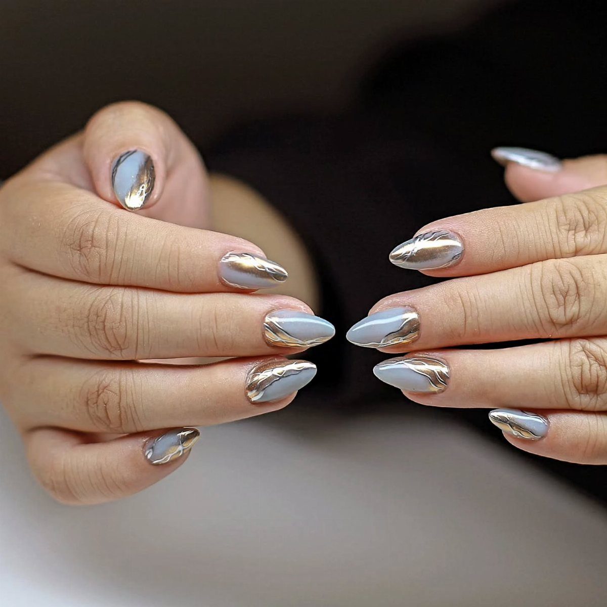
Nails are the smallest place a wedding palette can show up, and this set shows why metallics work against dusty blue: the gold and copper swirls read warm next to a cool, grayed base.
Almond tips give the accents room to curve.
Hand the manicurist a swatch of your bridesmaid fabric or invitation stock so the blue matches. I would keep the metallic to an accent finger or two if your ring is also gold.
2. Dusty Blue with Earthy Tones
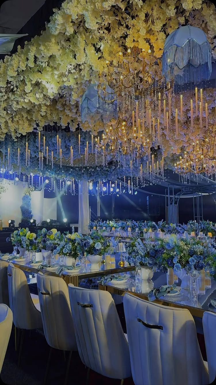
Warm yellow foliage overhead and blue florals below make the best pairing for a fall reception, because the two sit opposite each other on the color wheel and neither fights.
Dusty blue keeps the room from turning into a wall of orange.
The designer behind this one mentioned hanging crystals in the canopy, a good way to catch candlelight. Pull in rust, mustard or tan through linens and napkins, and keep blue in the centerpieces so it stays the anchor.
3. Dusty Blue Floral Arrangements
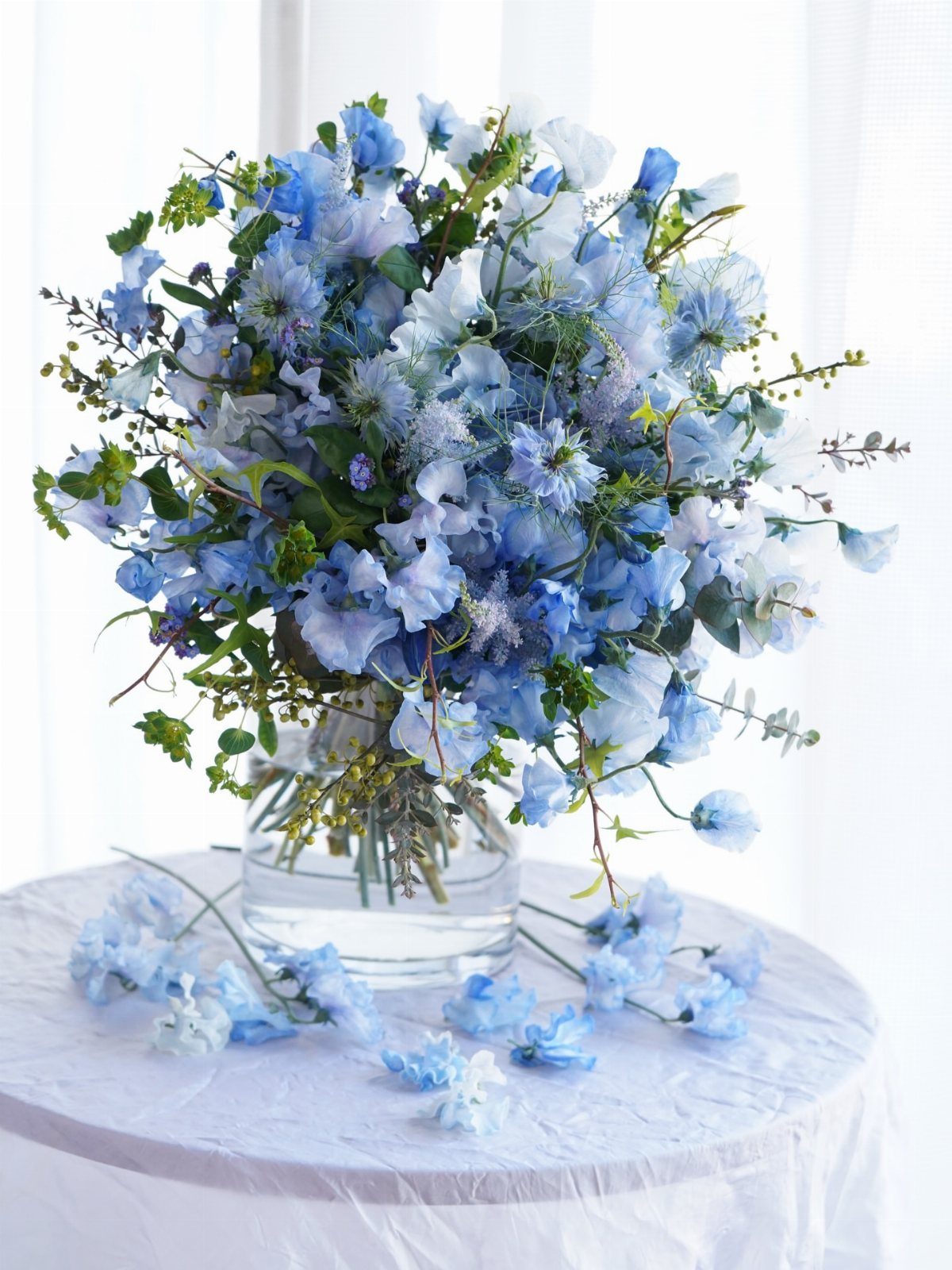
A single clear glass vase packed with dusty blue blooms is the cheapest way to get this look, since the flowers do all the work and the container stays out of their way.
Ask your florist what true blue flowers are in season for your date, then fill gaps with greenery or dried stems. Dyed or dusted stems are another option, but ask to see one first.
4. Dusty Blue Bridesmaid Dresses
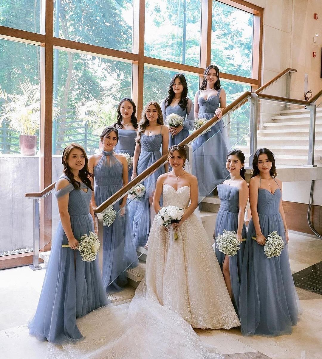
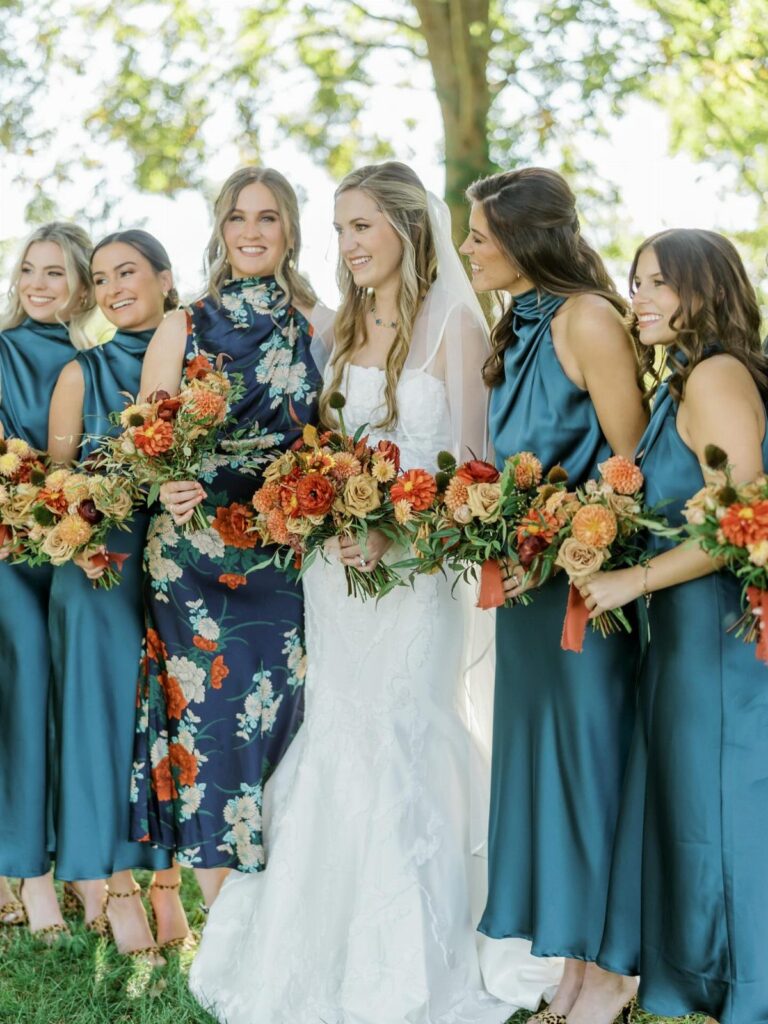
A full row of bridesmaids in one dusty blue is a lot of fabric to match, so order every dress from the same dye lot or the same maker. Against a white gown the shade looks soft instead of loud.
Let each woman choose her own neckline in the same color if you want a relaxed group.
Identical dresses look tidier on a staircase like this one. I lean toward the mixed necklines, since people actually wear them.
5. Dusty Blue with Emerald and Teal
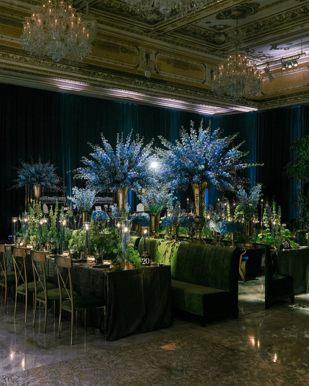
Teal drapery, emerald velvet and dusty blue flowers all sit close on the color wheel, which is why this ballroom feels rich instead of busy. The dusty blue centerpieces are the quiet part; the velvet and curtains carry the drama.
Velvet is the splurge, so rent it if you can. If the budget is tight, put emerald on the tablecloths only and let the venue’s own drapes, or none at all, handle the rest.
6. Teal and Autumn Floral Tablescape
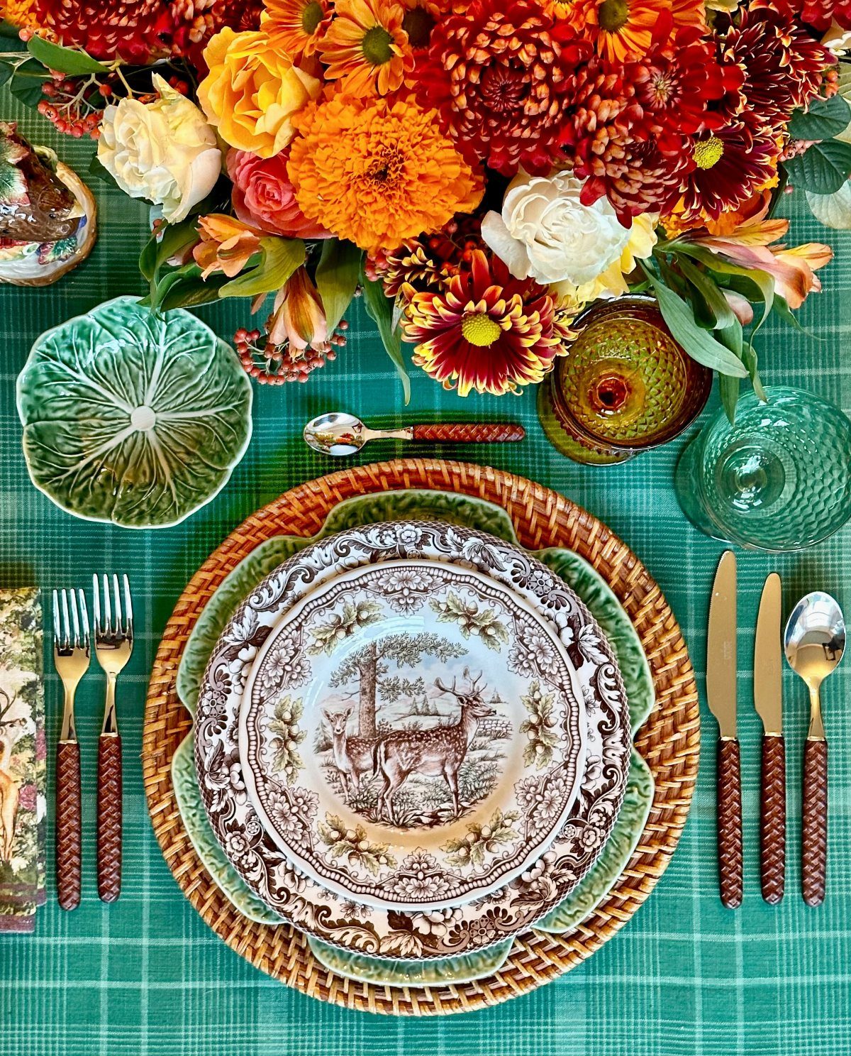
A teal checkered cloth gives a table pattern before a single flower arrives, so keep the florals loose and warm to avoid a clash. Woven chargers and gold cutlery add texture and shine without another color.
Deer-patterned plates are a bold choice, and I like them for a rustic or lodge-style fall dinner. Rent or borrow a few first; mixing patterns works only when the palette stays tight.
7. Navy Blue Groom Suit
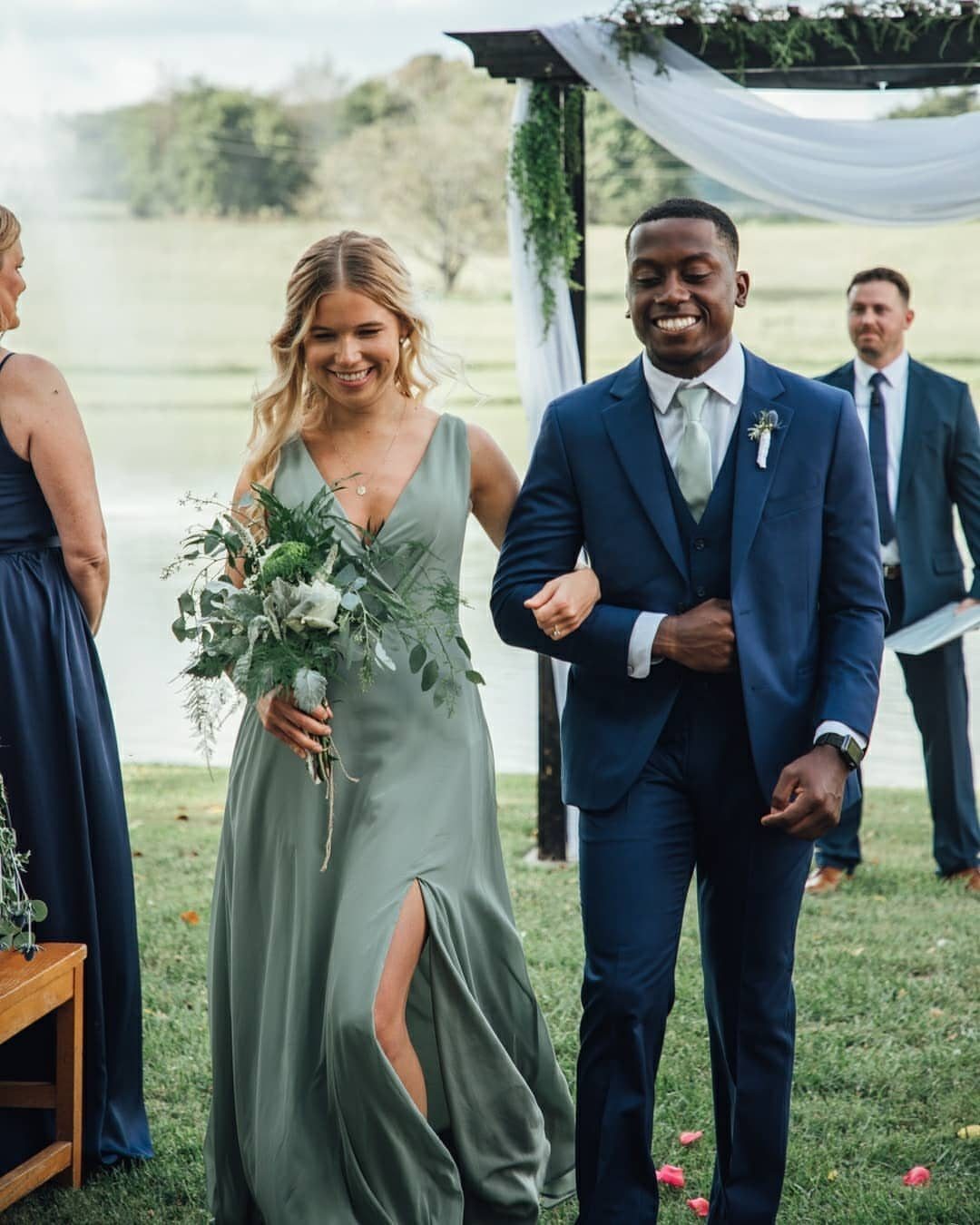
Navy is the groom’s suit that works with almost any bridal party color, and sage green is a calm partner for it. The two sit quietly together, so the blue reads as the anchor instead of a competing shade.
Pick a navy deep enough to stay separate from your dusty blue pieces; a mid-tone can look like a mismatch next to them.
Rent if the budget is tight, but if you will wear it again to work or events, buying makes sense. Keep the tie and pocket square in sage, rust or tan so the suit ties back to the fall palette.
Dusty Blue as a Fall Color
Dusty blue works in fall as well as it does in spring and summer, and it looks richer against October foliage than most people expect.
Its muted, cool tone sits well beside the warm shades of fall, so it works as a main color in an autumn palette.
Rust, mustard and deep burgundy are the partners worth testing first. Each one warms the blue without covering it, and the contrast looks planned rather than accidental.
Carry the blue through more than one piece so it reads as a choice. Invitations, table settings, bridesmaid dresses and the groom’s attire are the places to repeat it.
Make one warm shade the lead, whether rust, burnt orange or mustard, and let the other colors play support. That keeps the look cohesive instead of scattered, and it makes shopping faster when you are working against a deadline.