The five boards run from a color palette you can hold (burgundy and dusty blue with a cream or ivory neutral) and a swatch board of fabrics and ribbons, to a venue board built around photos of your actual site, with two more on why a board earns its place and when to start one.
Whichever you pick, pull colors from physical swatches rather than a screen, because they shift between phone and printer.
1. Wedding Mood Board Color Palette
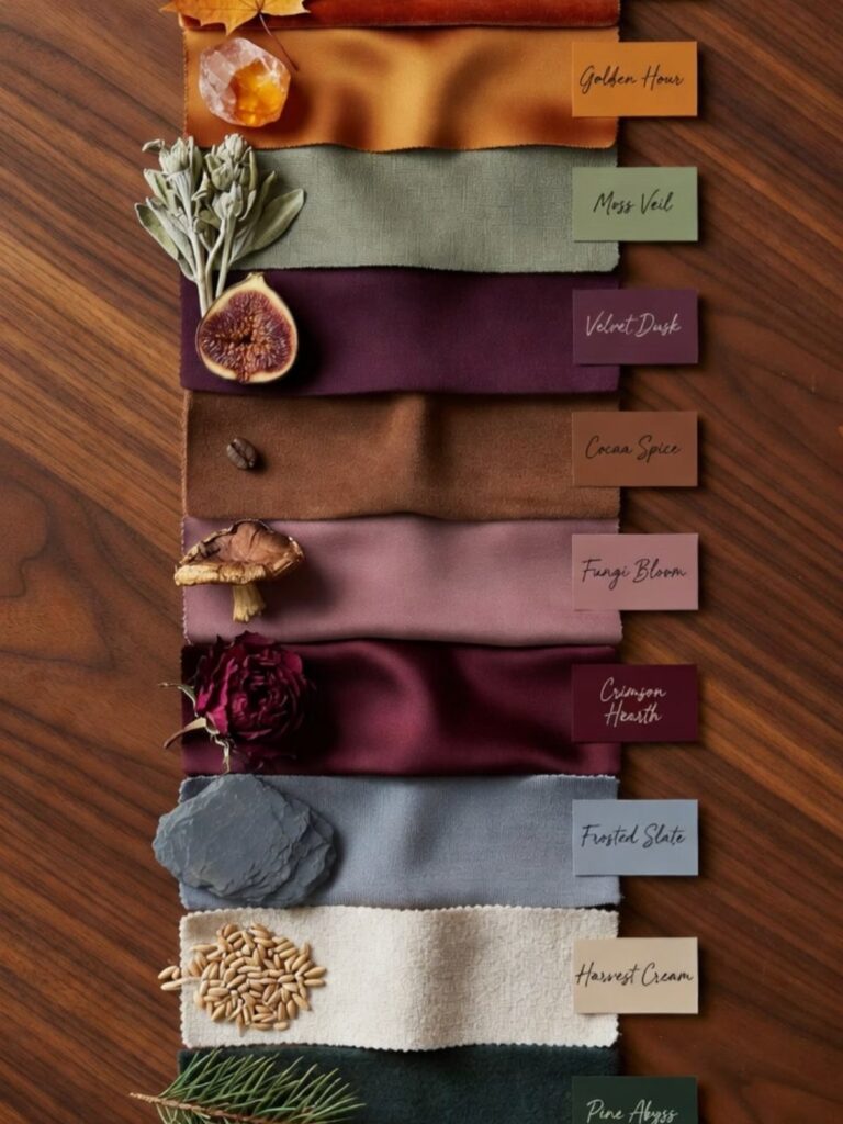
Burgundy and dusty blue make a palette with real contrast: one deep and warm, one soft and cool. Pick 2 main colors, then add a neutral like cream or ivory to give the eye somewhere to rest.
Pull every color from physical things you can hold, such as fabric, paper and a wax seal, rather than from a screen.
Colors shift between phone and printer, so a palette you only ever saw online can surprise you at the florist.
Price the palette against your budget first, since a deep shade usually asks for more of everything.
2. Fabric Swatches and Ribbons
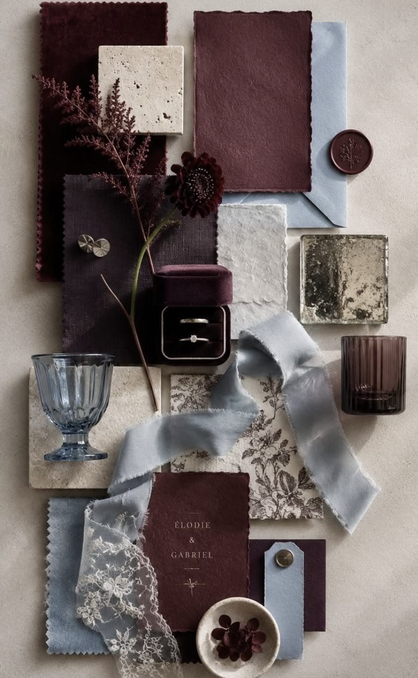
Swatches settle arguments that photos can’t, because you can feel the weight and see the color in daylight. Earthy shades like these are easiest to judge when each piece sits next to the others on a plain wooden surface.
Give each swatch a name, even a silly one, so you and your partner can say "I want Moss Veil on the tables" and mean the same thing.
Order samples before you order yards, and tape the final picks to your mood board. Ribbon is the cheapest way to repeat a color on bouquets, invitations and chair backs.
3. Wedding Venue Mood Board
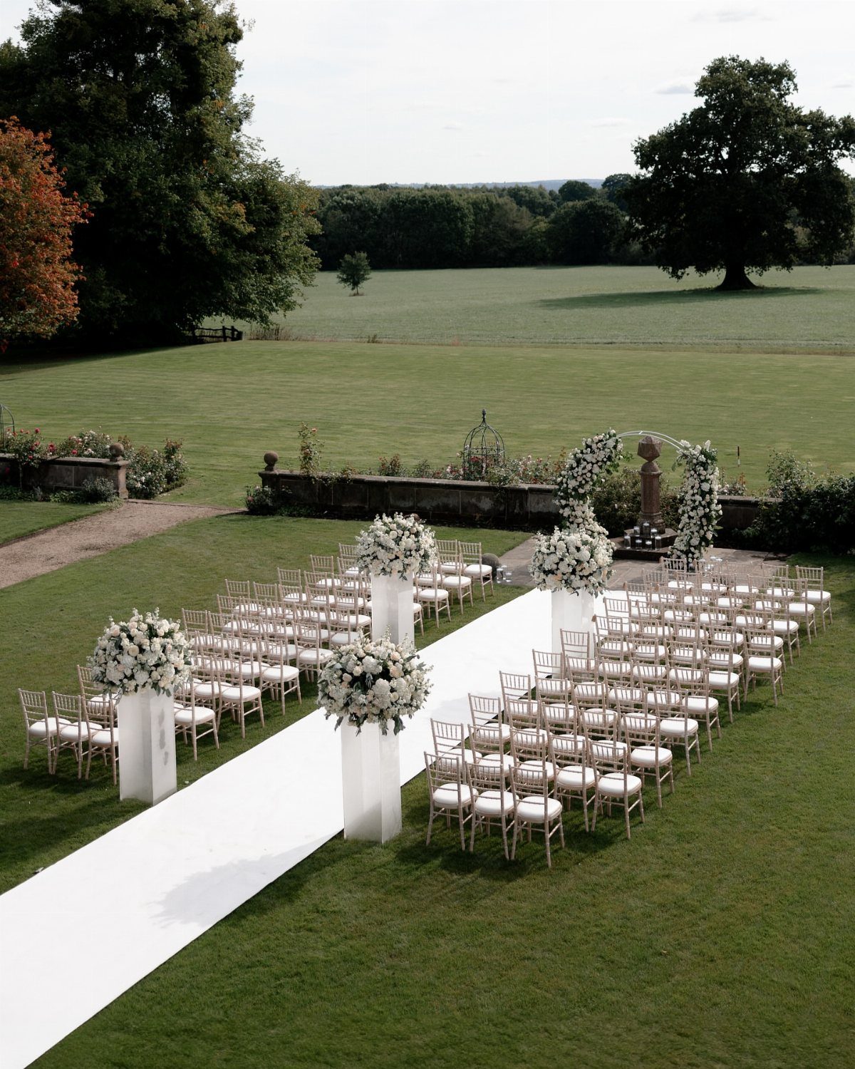
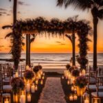
Start a venue board with the place itself: lawn, sky, horizon and the built pieces you’d add.
Save photos of your actual site first, then add inspiration that fits it. Mixing in images from a ballroom or a beach only confuses the vendors reading your board.
I’d rather commit to one setting and build details around it than chase a look the space can’t hold.
Benefits of a Mood Board
A mood board does its best work in the vendor meeting.
Words like "romantic" or "modern" mean different things to a florist, a photographer and a stationery designer, and a handful of pictures leaves far less room for that kind of drift.
Bring the board to every first call and let it do the talking. Designers often ask for inspiration photos before they start, because they can read your taste faster from images than from a description.
It also gives you a place to sort your own ideas. Seeing 20 saved photos side by side shows you what keeps repeating, and that repetition is your real style, which can differ from the one you thought you had.
Keep the board to images you would actually pay for. Anything you love but can’t afford belongs in a separate folder, so vendors quote against the look you intend to build.
When to Start Creating
Start the board before you book anyone. Your planner, florist and photographer should all be working from the same reference from the first conversation, which means fewer misunderstandings and fewer rounds of revisions later.
Your ideas will change as you plan, and that is fine. The board only has to be a starting point that keeps everyone aligned, not a final decision.
Because a vendor’s quote depends on the look you describe, an early board also keeps your budget honest.
A rough version made in a weekend, right after the engagement settles, is worth more than a polished one finished after the deposits are paid.
Revisit it when a major choice comes up, like the venue or the dress, and swap out any image that no longer fits.