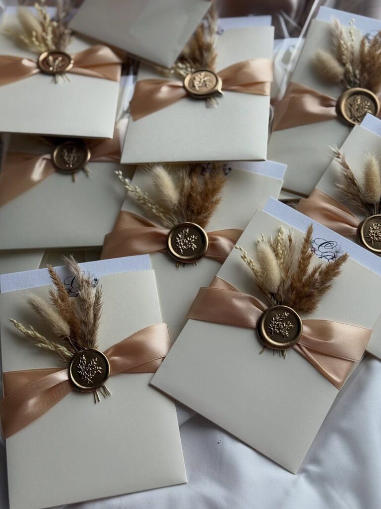
Boho wedding cards run from a simple watercolor invite with plain envelopes to an embossed floral layered card, and the guest list decides where on that range you can afford to land.
Hand finishes like the wax seal on an arched card, dried pampas, or twine and lace tied on one invitation at a time multiply with every name, so a short list can carry them and a long one should print the look instead.
1. Matching Wedding Stationery
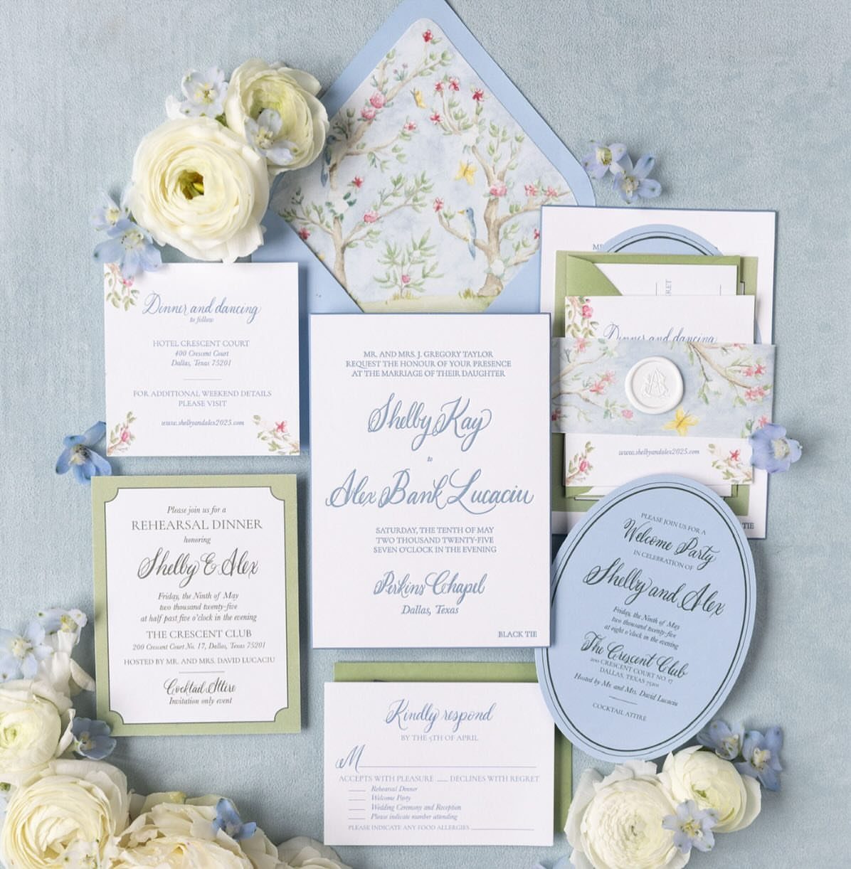
A full suite, with the invite, RSVP card and details card all sharing one floral pattern and one calligraphy style, makes a boho wedding look planned before the guest opens the envelope.
Matching is easier than it sounds: pick one illustration and one script, then reuse them on every piece.
Skipping extras is where I would save money. The RSVP and details cards are the ones worth keeping, since they answer the questions guests actually ask.
2. Whimsical Calligraphy
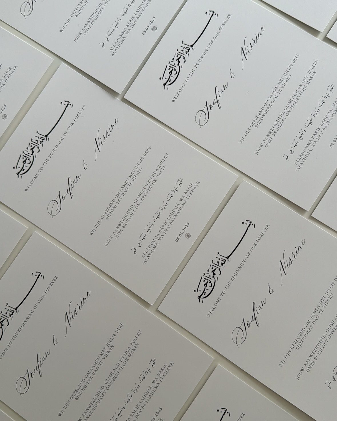
Handwritten-style lettering gives a card its personality faster than any illustration can. Loose cursive for the names, with a plain, quiet line of type beneath, keeps the card readable while still feeling personal.
Black ink on white is the budget-friendly choice, and it holds up well if a second language sits beside the English, as it does here.
Whichever script you pick, check that the names are legible at a glance before you order.
3. Twine and Lace Boho Wedding Card
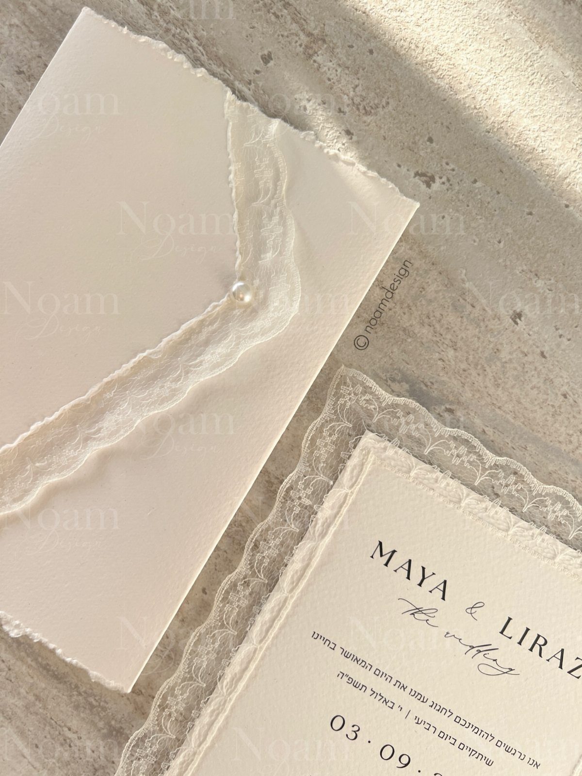
Lace trim and a pearl closure turn a plain white card into something guests will want to hold.
Twine does the same job for a rougher, more rustic version, so choose by how soft or earthy you want the first impression to be.
Both are small add-ons rather than full redesigns, so they stay workable when money is tight. I lean toward lace and a single pearl: restrained, and it still reads as handmade.
4. Rusty Brown Boho Wedding Card
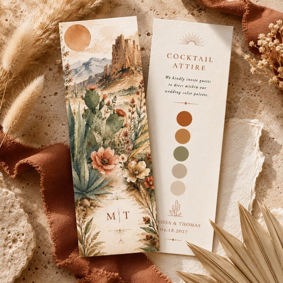
Rusty brown with olive green is the boho palette I trust most, because it looks warm without turning orange or loud.
A desert illustration on one card and a plain palette-and-dress-code card on the other lets the colors carry the theme.
Printing the palette on the card, as this one does beside "cocktail attire," quietly tells guests what to wear. Keep the paper matte and the ink soft so the earthy tones don’t look flat.
5. Boho Watercolor Invitations
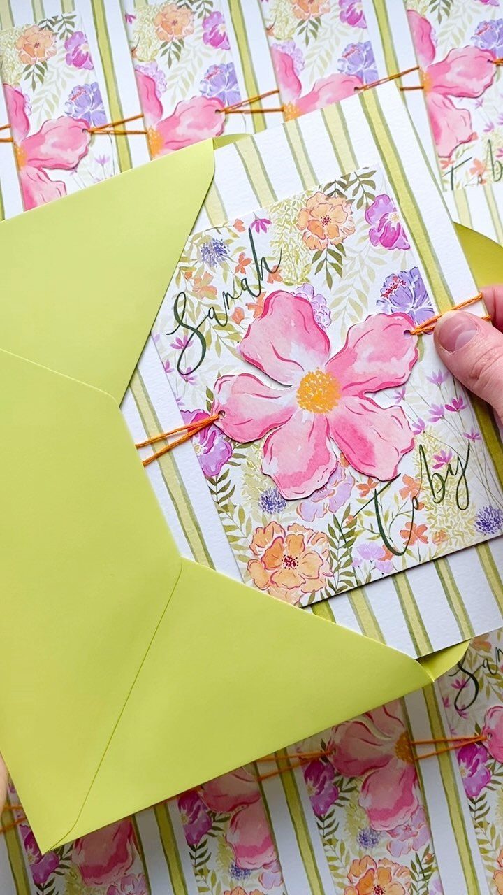
Soft watercolor washes with pink blooms give an invitation the look of a small painting, and a bright envelope, like the lime green one here, makes it pop from the mailbox pile.
Tying string by hand is the labor-heavy part.
The maker of this piece tied 150 threads, one for each invitation, so count your guest list first, because that finish multiplies with every name you add. If time is short, print the watercolor and tie only a short ribbon.
6. Dried Florals and Pampas Grass
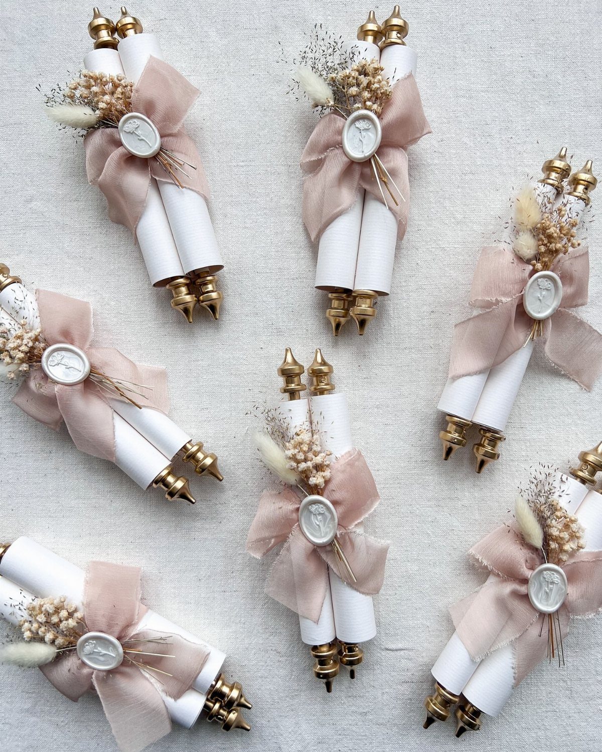
Dried pampas grass and small dried florals tucked under a ribbon turn a rolled scroll into a keepsake.
Scrolls cost more in assembly time than flat cards, so I would make them for a small list or keep the dried bunches tiny. Delicate stems can break in the mail, so consider handing them out in person.
7. Personalized Envelopes
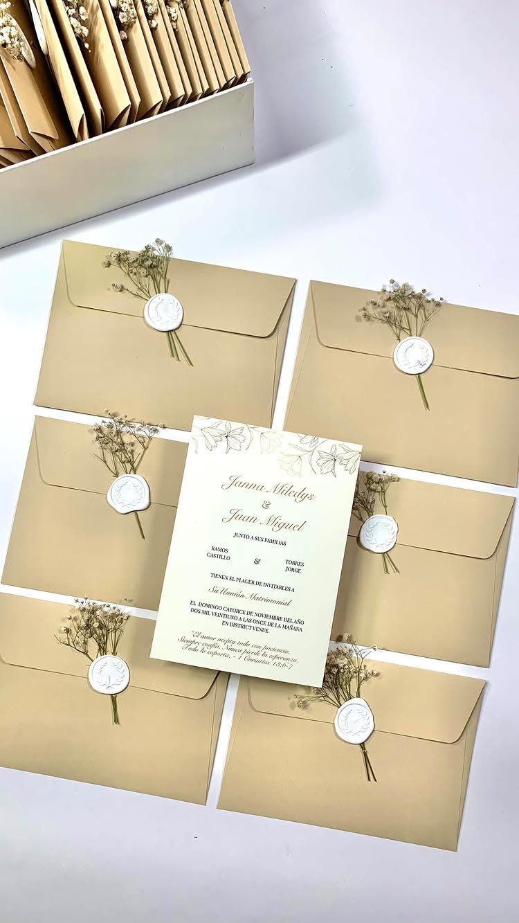
Brown kraft envelopes take a white wax seal and a pinch of dried baby’s breath well, and the pale accents stand out against the earthy paper.
Matching the envelope to the invitation inside is a small step that makes the whole mailing feel considered.
Wax and dried stems add hand time, so I would do them for a short guest list, or seal only the envelopes going to immediate family.
Plain kraft with a stamped return address still reads as boho and costs far less.
8. Arched Shape with Wax Seal
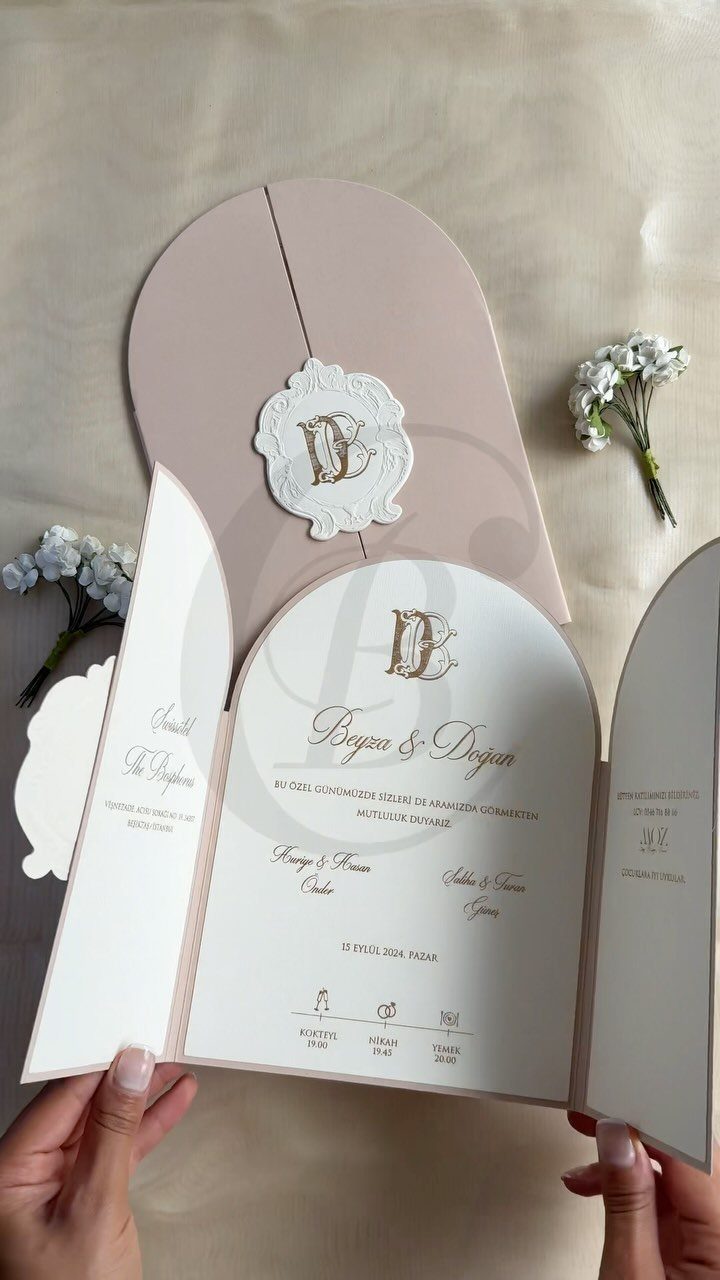
An arched top softens a card the way a doorway does, and pale pink with gold calligraphy keeps the boho mood romantic instead of rustic. The custom wax seal is what finishes it.
Gold lettering looks best when the names stay large and the details stay short, so keep the wording tight.
An arched card suits a gentle, feminine palette better than any other shape, because the curve softens blush, sage, and cream. A custom seal costs more than a stock one, so a simple monogram is the sensible compromise.
9. Whimsical Illustrated Camper Van Design
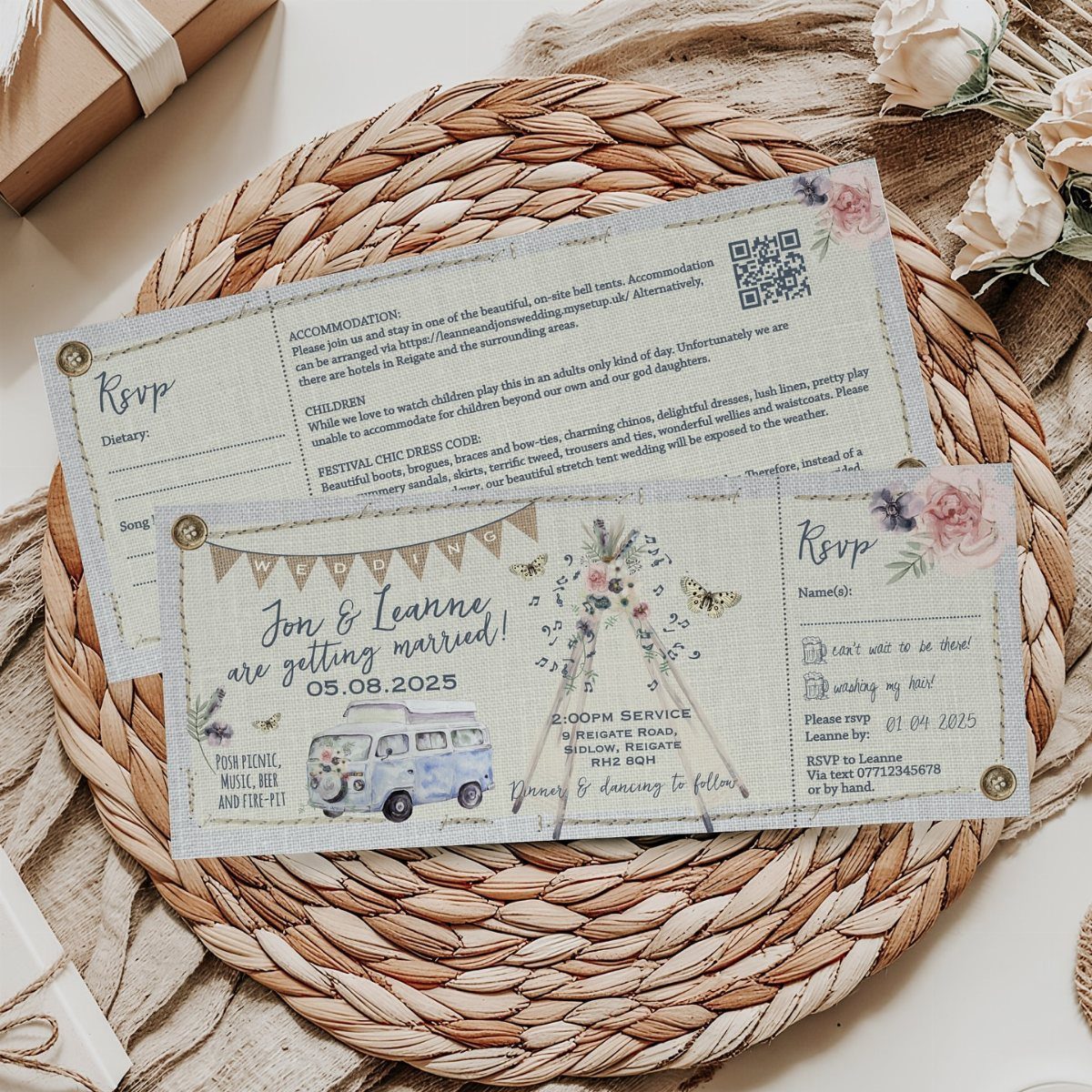
Illustrated motifs like a camper van, a teepee and a few wildflowers tell guests the tone of the day before they read a word. Put them on a set, not a single card, so the invitation and RSVP details match.
This is the best pick for a laid-back, road-trip kind of couple, and a little too playful for black tie.
Ask your designer to limit the artwork to a small handful of motifs, since every extra drawing adds to the design bill. Keep the date and RSVP text in plain type so nobody has to squint.
10. Embossed Floral Layered Card
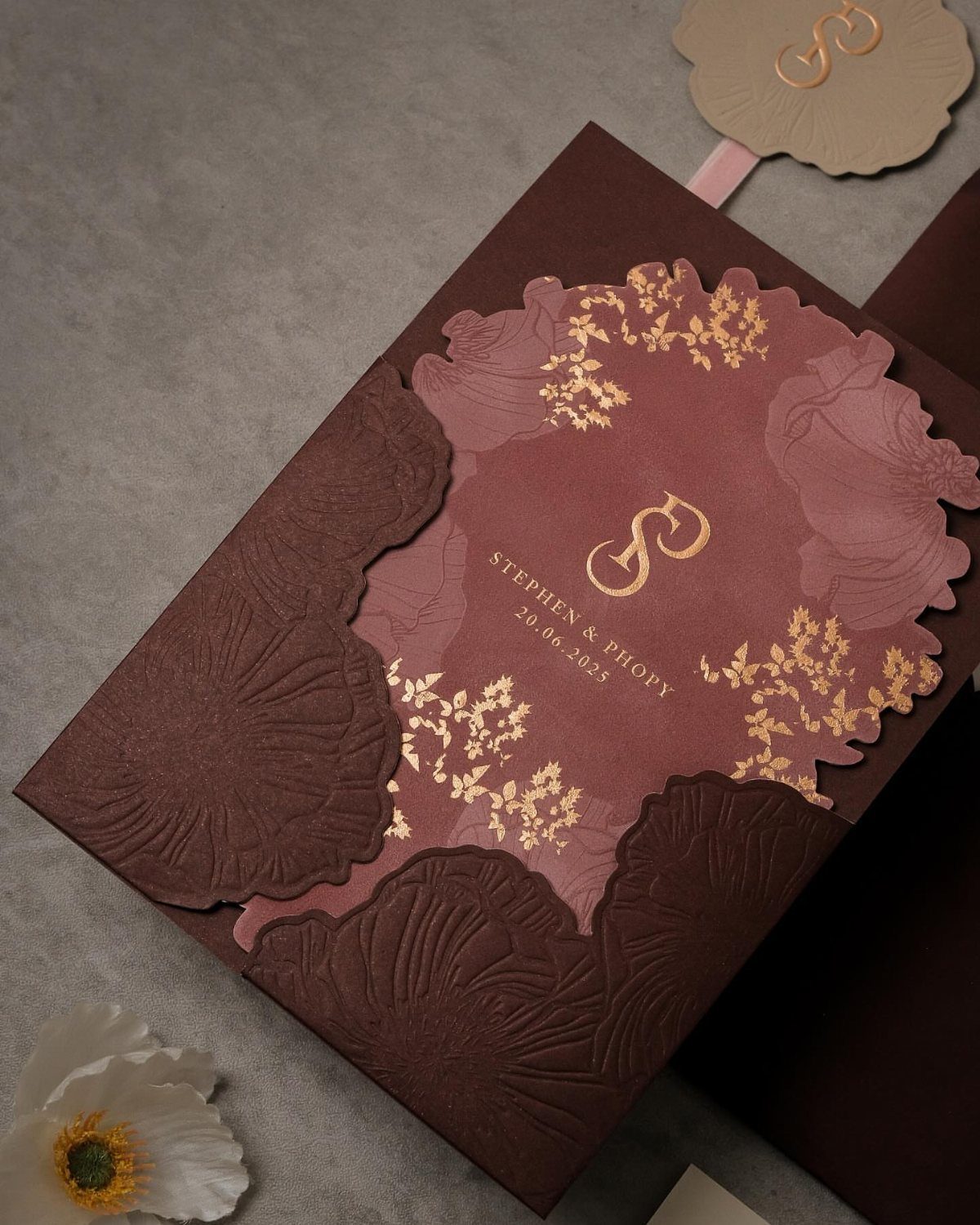
Burgundy layered over mauve gives a card depth, and embossed floral edges add texture you can feel with a thumb. Gold foil lettering then catches the light on the names and date.
Each layer, emboss and foil is a separate print step, so this is the splurge on the list.
I would spend on the foil and the emboss and skip extra inserts. Ask for a printed sample before ordering the full run, because dark paper can swallow thin foil lines.
Choosing the Right Invitation
Set the invitation budget before you look at a single design. A common rule of thumb is 2%–5% of the total wedding budget for invitations and stationery, and the guest list sets the count, so finalize it first.
Lock your venue and date before ordering, too. Season and setting tell you which colors make sense: a summer wedding might call for terracotta or navy.
If you love one print, carry it onto programs and place cards so the day feels connected.
Sustainable Options
Eco-friendly materials suit boho because the style already leans on nature and handmade quality. Recycled paper and natural fibers are the easiest places to start, and they cost nothing extra in looks.
Silk ribbons, tassels, and dried flowers can add a personal touch, but pick one. A single natural accent reads as intentional, while three start to look crowded.
Boho palettes are flexible, so the greener choice doesn’t limit color. Burgundy, blush, any jewel tone or pastel works, and even black can sit comfortably in the mix.
Flower crowns, macrame arches, and long lace dresses with breezy bell sleeves—boho weddings are trendy and timeless all at once.
Invitation Etiquette
Digital invitations make the paperwork lighter. With an online RSVP, replies land in one list, so you can see who said yes, who said no, and who never opened the invite, and you know exactly whom to nudge.
That second piece of information is the one I’d use. Send a group reminder to the unopened list a few weeks before your deadline, and save individual notes for the guests whose answers you truly need.
A venue change or a shifted start time also goes out to every guest in one message, which saves you a long chain of texts and calls.
A paper card can still go to grandparents or anyone who prefers it, with the digital version covering everyone else.
Frequently Asked Questions
What does a boho wedding mean?
A boho wedding leans on nature, artistic touches, and relaxed romance.
On paper that shows up as florals, handwritten-style lettering, dried stems, kraft envelopes, and earthy colors. The style also suits recycled paper and natural fibers, since it already values handmade quality.
What colors are typically used for a boho wedding?
Rusty brown with olive green is the palette I trust most, because it feels warm without turning orange or loud.
Salmon pink and greenish gray also fit, and burgundy, blush, jewel tones, and pastels all work. A little black can work too, usually in lettering or a candlestick, so the palette bends further than most people expect.
What to wear to a boho wedding as a guest?
Let the invitation tell guests.
Printing the palette and a dress code, such as "cocktail attire," on a details card quietly steers what people wear. Asking guests to draw from the wedding colors, like rusty brown and olive green, keeps the group looking cohesive.