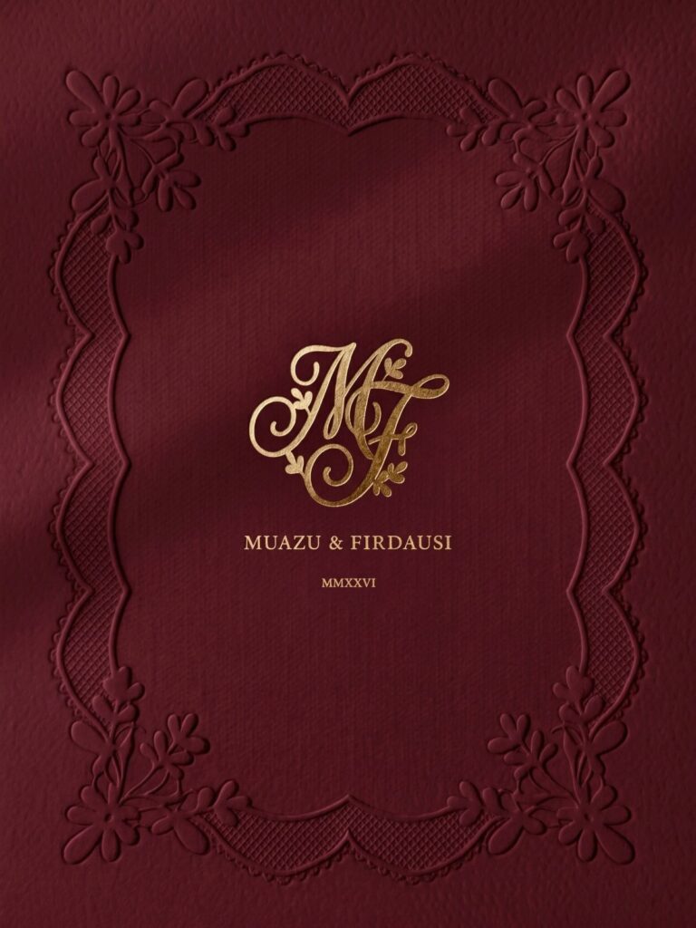
These ideas run from a single cursive letter in a light palette to a 2-letter monogram on invitations, napkins and a cake topper, and the price climbs with every extra layer of detail, from a floral wreath to a custom design in place of a template.
Your budget decides which one fits: if the number is tight, pick one mark, spend on a custom design for it, and repeat it everywhere.
1. 2-Letter Monogram
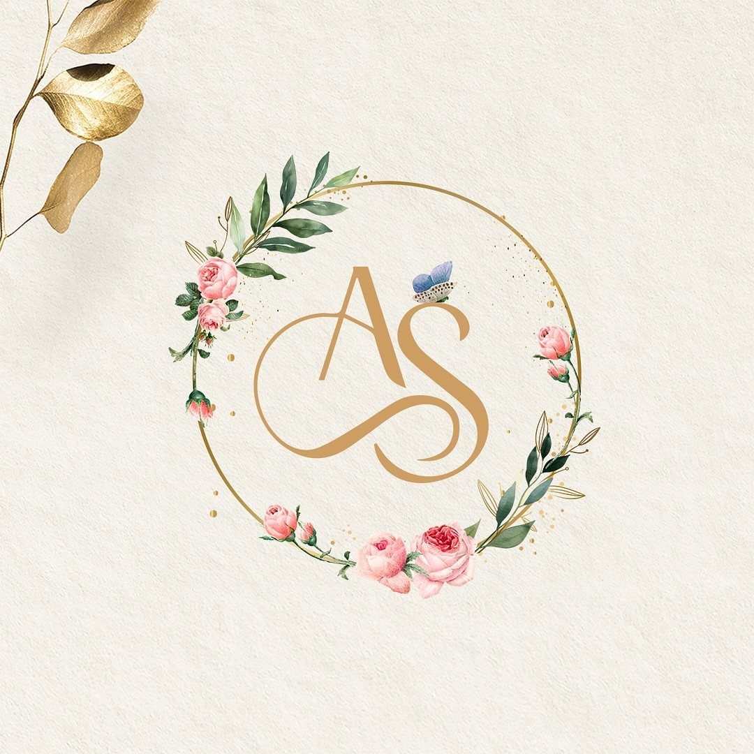
A two-letter monogram is the simplest version to commit to: just your two first initials, set so they read as one mark.
Gold on cream gives you a mark that works as well on a day-of sign as on a save-the-date, because the contrast stays readable at both sizes.
Use it before the ceremony and after it, on everything from the invitation to the thank-you card. Repeating one mark is cheaper than commissioning new artwork for each piece, and that repetition is what makes it feel like a brand.
2. Monogram on Invitations
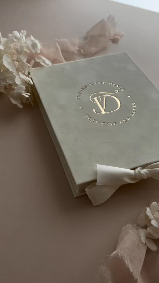
Guests meet your wedding’s look on the invitation before anything else, so the monogram belongs there first.
Foil or embossing makes a monogram tactile, and pairing it with a boxed invitation suite gives the set a finished look, though each extra piece adds to the per-suite cost.
Skip the tassel if the budget is tight. A single foil-stamped monogram on the envelope flap or the card top carries the identity with far less cost.
I would pick one finish and stick with it: foil or emboss, not both fighting for attention. Whatever you choose here sets the tone for every piece that follows.
3. Monogrammed Napkins
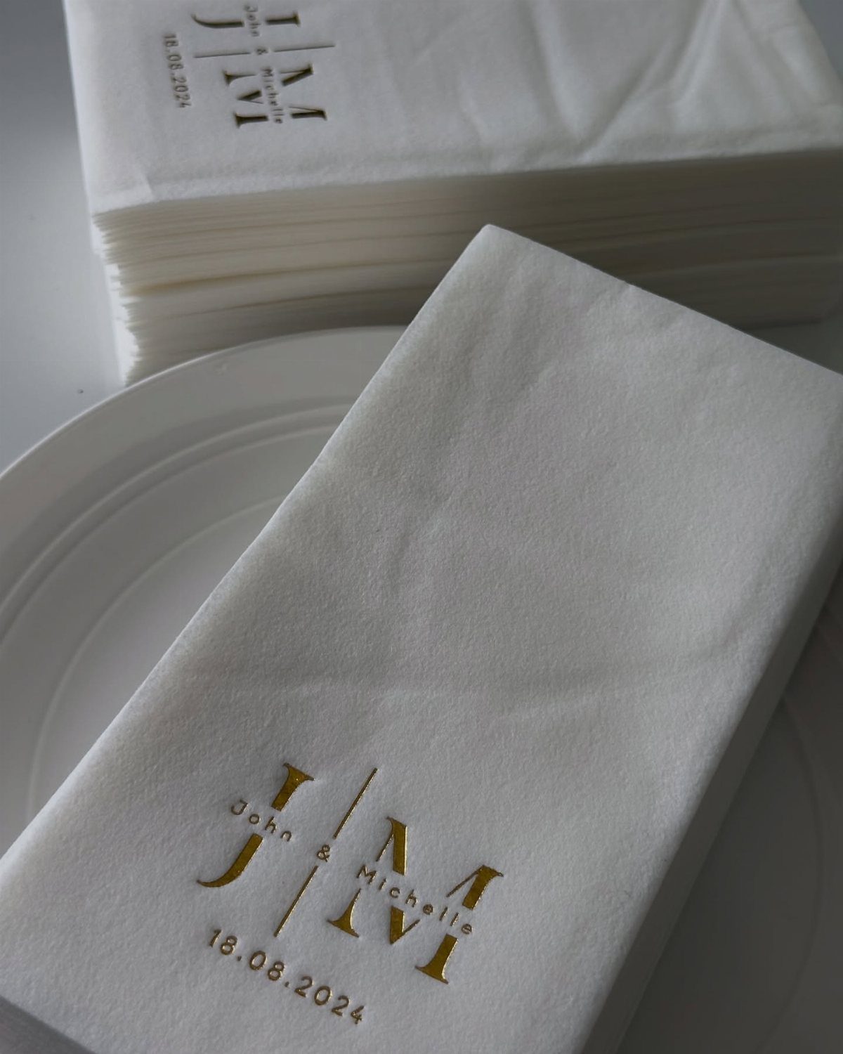
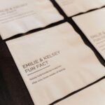
Napkins are where a monogram pays off quietly. Printed with initials, names and the date, as above, they tie the table to the invitation without adding another centerpiece to buy.
Keep the print small and to one corner or the center fold, so it reads as a detail and not as noise. Gold foil on white matches nearly any palette, which makes it the safe order.
Check the proof for the date format before you approve it. Digits are easy to transpose.
4. Serif Fonts Monogram
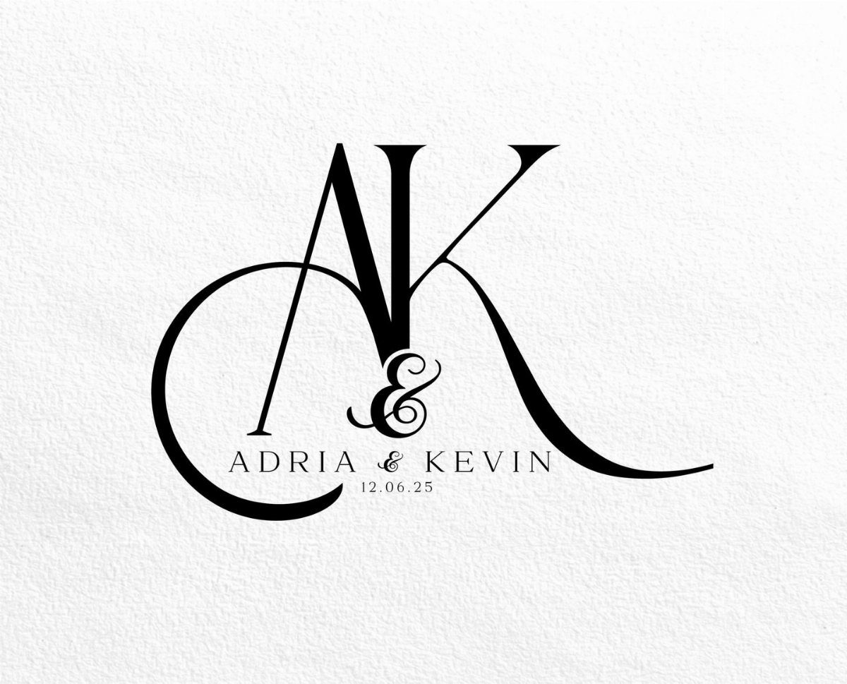
Black serif letters give a monogram a formal, printed-in-a-book feel. Set the two initials with an ampersand between them, and add the names and date beneath in the same family so the whole mark reads as one piece.
Choose a serif with clear contrast between thick and thin strokes; it looks sharp at large sizes and still reads small.
Black on white is also the easiest combination to print cheaply, which helps when the budget is a hard number.
5. Light Color Palette Wedding Logo
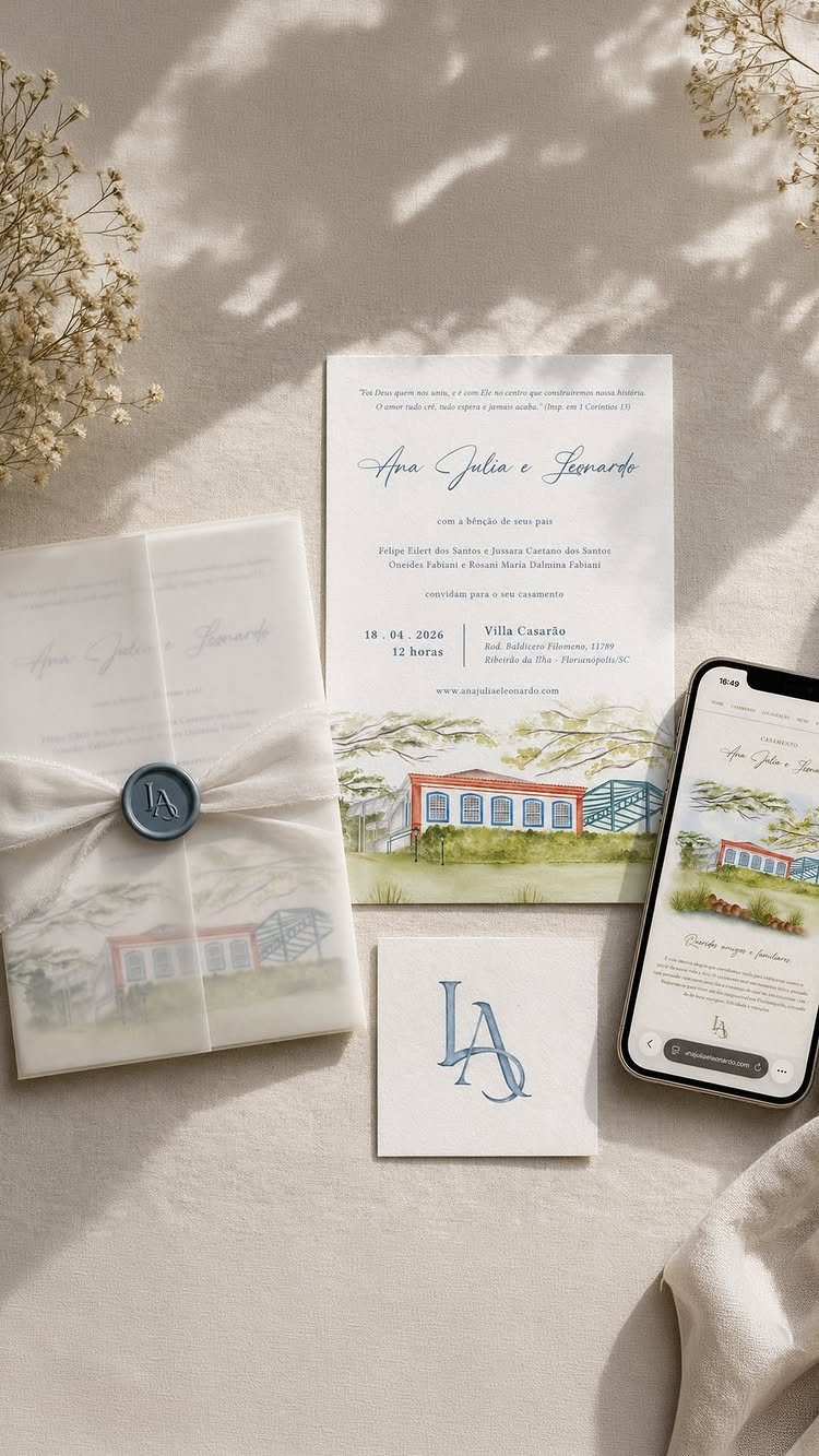
Soft blue on a light beige ground keeps a logo calm, and it is easy to repeat across a whole suite: the wax seal, the card and the wedding website above all carry the same mark.
Light palettes forgive a lot.
They pair with almost any flowers, and a pale logo will not fight your decor. The cost is contrast, so test the color on actual paper before ordering, and on a phone screen if your website will show it.
A wedding logo can help set you apart from others in the industry, evoke emotional responses from your audience, and help make your brand (or special day) more memorable.
6. Single Cursive Letter Monogram
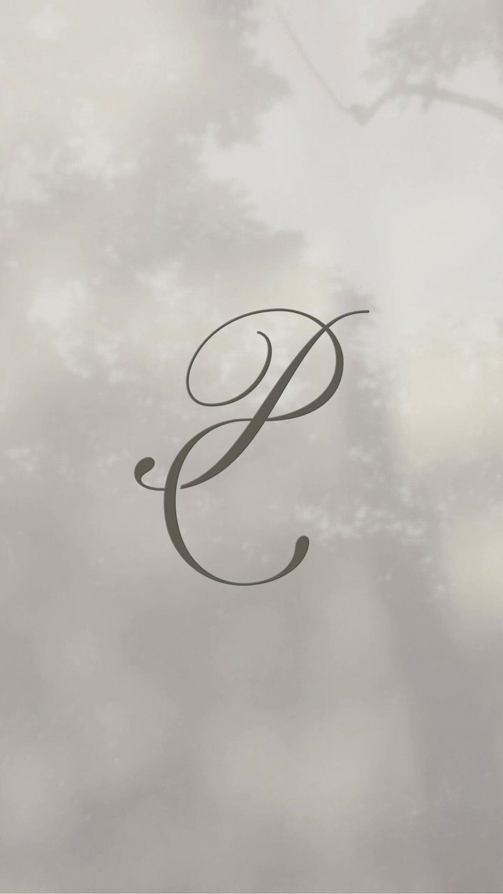
One cursive letter is the quietest monogram you can make. Pick the initial of your shared last name, set it in a flowing script, and give it room: plenty of empty space is what makes it look expensive.
A muted taupe keeps it soft and works against almost any backdrop. I like this version for couples who want a mark that feels more like a signature than a logo.
Pick a script with clear letterforms, since a very ornate P or J can turn illegible at small sizes.
7. Monogram Cake Topper
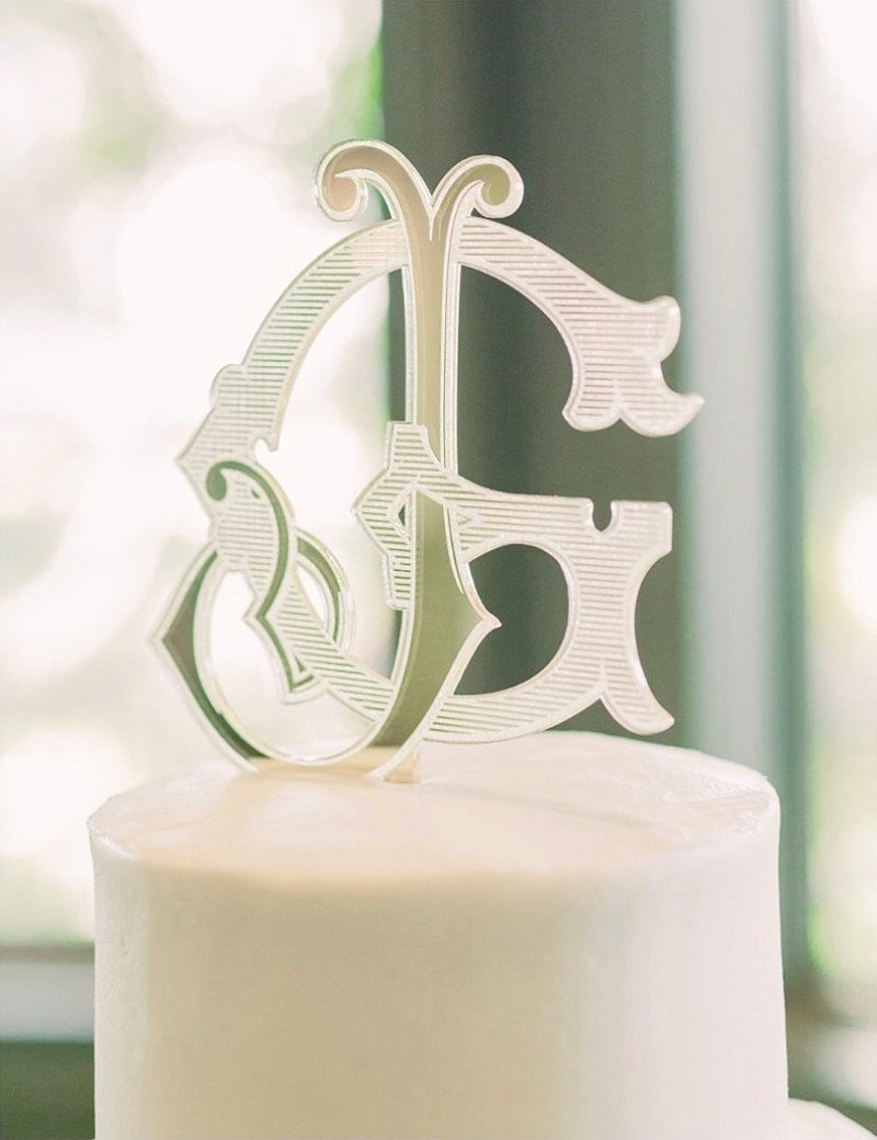
A cake topper is the one place your monogram gets a spotlight of its own.
Intertwined silver letters on a white frosted cake read as clean and formal, and the metal catches the light without adding a single flower to the order.
Keep the cake plain around it. A topper this graphic does its best work against smooth frosting, so skip heavy piping near the top tier.
I would also choose the topper to match the foil or ink on your invitations, so the mark you sent out months earlier shows up again at the cutting.
8. Floral Wreath Monogram
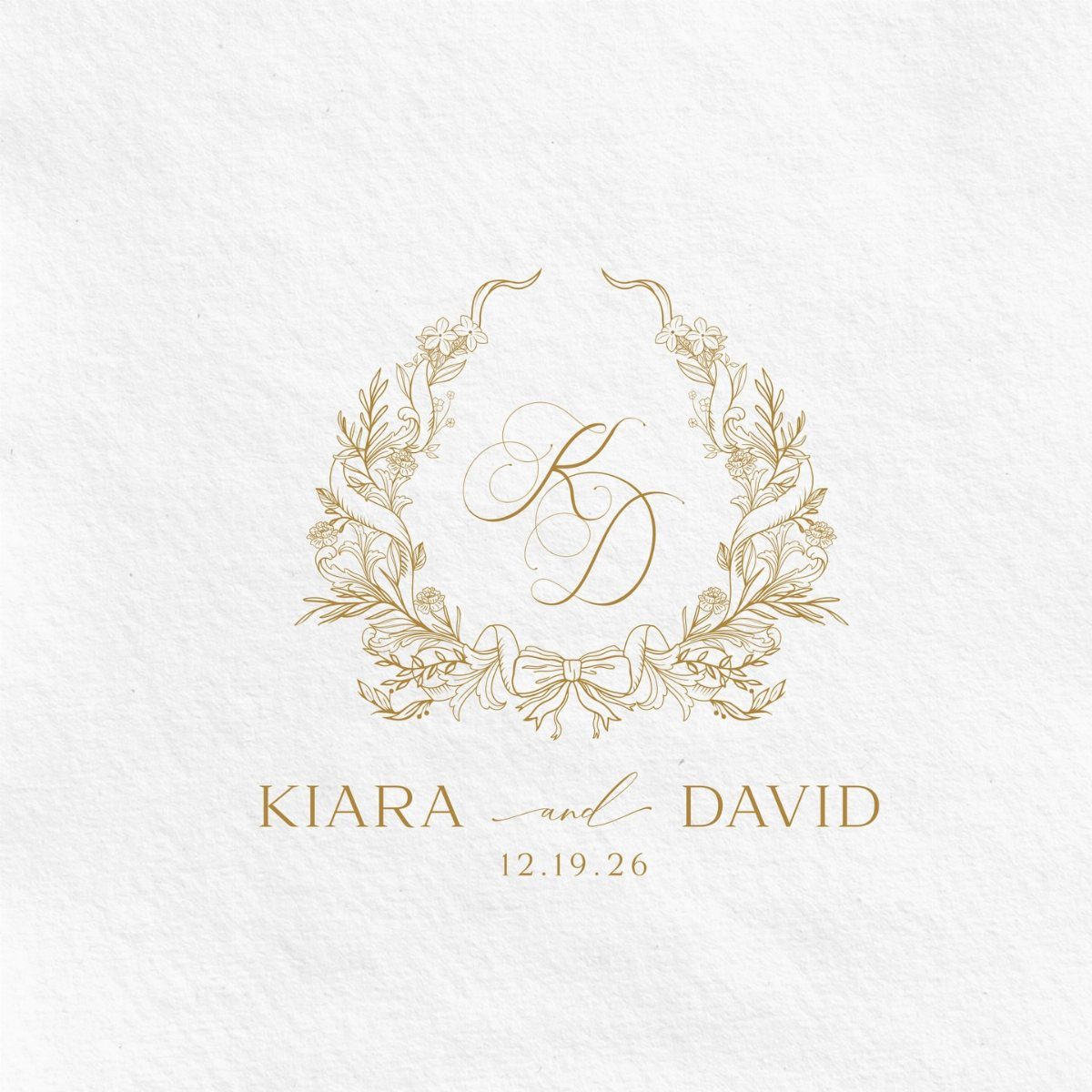
A floral wreath around your initials turns a plain monogram into a small crest.
Gold line work on white textured paper keeps it soft, and the names and date set beneath the wreath make it usable as a full logo on the invitation and the website.
Keep the wreath light and the letters large. Fine leaves and stems can fill in at small sizes, so test the mark at the size of a wax seal or envelope flap before you order.
Gold ink or foil on textured stock costs more than flat black print, so reserve it for the pieces guests keep.
Importance of Monograms
A monogram earns its cost by working everywhere. The same mark can sit on paper goods, decorations and the wedding website, then carry on after the wedding as stationery.
Price depends on how much detail and artwork you want and how you get the design, so there is a version at nearly every budget.
I treat it as the foundation of the look, not an accessory. Choose it before you order anything else, and invitations, signs and decor will line up without extra effort or clutter.
Monogram Etiquette
Shading is the rule most couples miss.
In a classic three-letter monogram, the two first initials sit small on either side, drawn as thin outlines, while the surname initial stands taller in the center in a solid, heavier stroke that anchors the whole mark.
Odd name situations deserve a decision before you hire anyone. A hyphenated last name, a partner keeping her own name, or a two-word surname like Von Hansel each changes which letters you use and where they sit.
Settle those questions in writing, then give the designer the final spelling. Redoing a mark after the invitations are printed costs far more than a few minutes of talking it through now.
Custom Vs. Template Designs
A template is fine if you only need a mark for one printed piece. A custom design earns its fee when the mark has to carry across everything from invitations to signage to napkins.
A designer thinks about things a generator does not: how the mark scales across formats, whether it reads from a distance, and whether it works in print, foil and projection.
Ask for all of those up front, along with the file types you will need for long-term reuse.
If the budget is tight, I would put the money into custom work for the monogram and keep everything else simple.
Monograms date back to at least 350 B.C., when ancient Greeks stamped them on coins, so a clean, formal design is hard to get wrong.